
Book Formatting for Self-Published Authors: What Readers Notice First
August 26, 2026
What Makes a Publication-Ready Book? A Complete Author Checklist
August 31, 2026Cover Design for Indie Authors: Choices That Help Books Look Professional


Readers encounter your cover before they experience your plot, argument, voice, or expertise. In seconds, they form an impression: What kind of book is this? Is it meant for me? Does it look credible enough to explore?
That is why cover design for indie authors should be treated as visual positioning rather than decoration. The most useful question is not simply, “Do I like this cover?” It is, “Will the intended reader understand what this book is, how it will feel, and why it may be relevant?”
What makes cover design for indie authors look professional?
A professional indie book cover clearly signals the book’s genre and intended audience, establishes a readable visual hierarchy, uses typography and imagery intentionally, remains legible at thumbnail size, and works correctly in print and digital formats. Professionalism comes from how well the choices work together—not from one design style.
A minimalist memoir, illustrated fantasy cover, photo-driven thriller, and bold business book can all look professional. Strong designs share several foundations:
- Clear genre positioning
- An appropriate tone
- Strong visual hierarchy
- Readable typography
- Purposeful imagery
- Controlled color and contrast
- Technical accuracy
- Consistency across formats
Professional design is not one style. It is a collection of choices that make sense together.
Genre recognition helps readers understand the book quickly
Genre conventions give readers useful visual shorthand. A reader won’t consciously analyze the font, image treatment, or color palette, but those elements identify whether a book is a romance, thriller, memoir, business book, fantasy novel, or self-help guide.
That does not mean copying another cover. It means understanding the category’s visual language.
A cozy mystery and a psychological thriller both involve danger, but they should not create the same impression. One might use an illustrated setting and approachable type; the other may rely on sharper contrast, tension, or negative space.
Before approving a concept, review current books for the same audience and subgenre. Look for recurring patterns without imitating a particular title. A cover can be attractive and still be commercially confusing if it signals the wrong genre or audience.
| Evaluation question | Strong professional signal | Potential problem |
| Can readers identify the category? | Familiar but distinctive genre cues | Attractive imagery with no clear category |
| Does the tone fit the content? | The visual mood reflects the reading experience | The cover promises a different kind of book |
| Does it suit the audience? | Choices reflect reader expectations | The design mainly reflects the author’s taste |
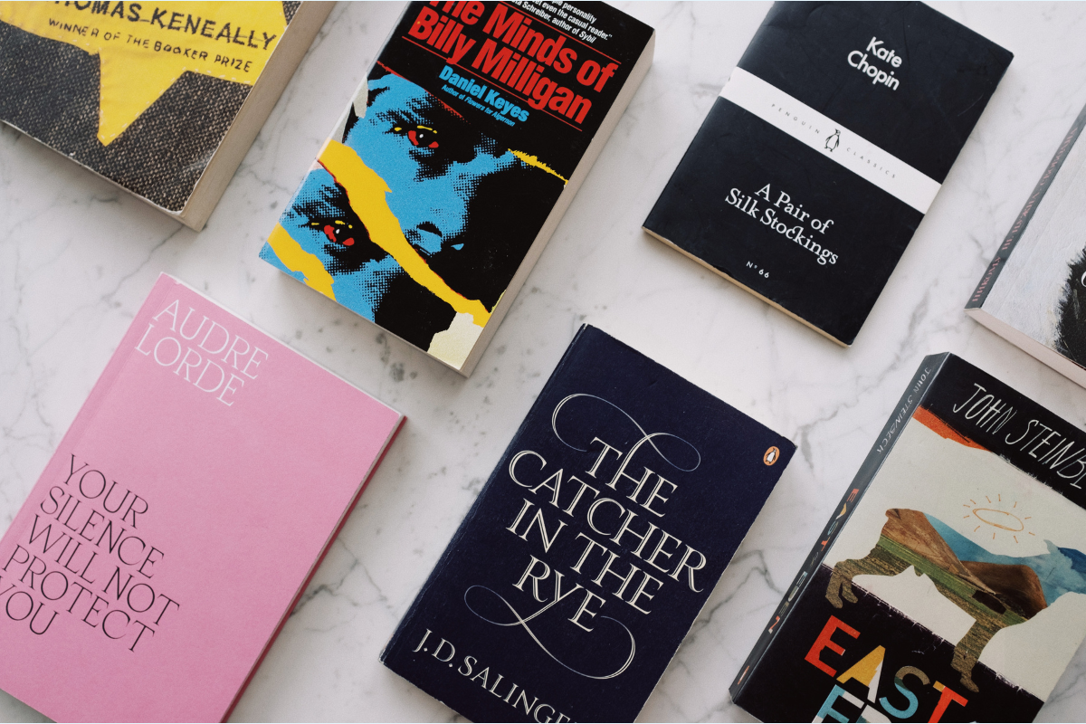
Visual hierarchy tells readers what to notice first
Visual hierarchy is the order in which a viewer notices the cover’s elements: title, subtitle, author name, series information, endorsement, and central image.
Not everything can receive equal emphasis. When every element is large, bold, brightly colored, or treated as a focal point, the reader won’t know where to look first.
Strong hierarchy uses size, weight, contrast, placement, spacing, and framing to guide attention. Adobe’s overview of visual hierarchy explains how designers create emphasis through greater visual weight.
The title is often primary, though an established author’s name or a practical nonfiction subtitle may need more prominence. Negative space can also make key elements easier to notice.
Try a five-second test: Show the cover to someone, hide it from them, and ask what they noticed first and what they think the book is about. If the answers do not match the intended message, the hierarchy may need refinement.
Typography communicates tone before readers process the words
Book cover typography does more than display a title. It establishes personality. A typeface can suggest authority, intimacy, suspense, history, playfulness, elegance, technology, or urgency.
No font is always professional or unprofessional. Judge typography by fit, readability, execution, and consistency. A suitable typeface can still fail when spacing is uneven, line breaks confuse the title, text disappears into the background, or too many styles compete.
Most covers benefit from a restrained typographic system in which the title, subtitle, author name, and supporting text each have a clear role.
Decorative or unconventional typography can work when it supports the genre and remains legible. Always test the design on a phone and at retail thumbnail size. Type that looks impressive on a large monitor may lose its clarity when reduced.
Imagery, color, and composition should support the book’s promise
Imagery and color are communication tools, not universal taste tests. A dark cover is not automatically more serious, and a bright cover is not automatically more accessible. Meaning comes from how color, imagery, typography, and composition interact.
Strong covers often begin with one clear visual idea: a symbolic object, portrait, landscape, abstract form, or illustrated scene. A design feels unresolved when unrelated images, effects, borders, taglines, and typefaces compete for attention.
Stock photography works best when cropping, lighting, color treatment, texture, and typography make it feel integrated. Custom illustration should likewise fit the genre, tone, and age group.
Color should reinforce the intended mood and create enough contrast for text to remain readable. Avoid oversimplified rules such as “blue means trust” or “red means danger.” Color associations depend on context, culture, genre, and surrounding imagery.
Both simple and complex covers can look professional—the deciding question is whether every element has a clear job.
A cover must work as a thumbnail and as a physical object
Many readers will first see your cover in an Amazon result, on a phone, in an email, or on social media, and a design that looks striking at full size may lose its title, focal point, or genre cues when reduced.
Test each concept at full size, at a realistic retail thumbnail, on a phone, in grayscale, beside comparable books, and as a complete print wrap.

Digital and print covers have different requirements. An ebook usually needs only a front-cover image, but a print book—paperback or hardcover—requires a complete composition that may include the front, spine, back cover, barcode area, and (depending on the format) flaps for a dust jacket.
Spine width changes according to page count, trim size, paper type, and printing specifications. Bleed, safe areas, resolution, and file setup determine whether the finished cover prints correctly. Amazon KDP’s paperback cover requirements explain expectations for a full-wrap file, including bleed, safe areas, spine measurements, and image quality.
Technical compliance alone does not create an effective cover, but a strong concept can still fail if the production file is incorrect. The cover and interior should also feel connected. Professional book formatting services can support that continuity through coordinated typography, chapter styling, spacing, and format preparation.
Professional does not mean generic, trendy, or overloaded
Professional design is often confused with copying successful books, following trends, or adding more elements.
Your cover should belong in its market without resembling one specific bestseller: It’s familiar enough to orient the reader but distinctive enough to stand out and be remembered.
Trends can make a cover feel timely, but they date quickly. There’s also no guarantee a trend fits the content. Likewise, extra fonts, effects, badges, and decorative details dilute the central message. Use complexity only to serve meaning.
Authors seeking a step-by-step overview can review Elite Authors’ guide on how to design a book cover. When evaluating concepts, however, the core question remains: Do the choices work together to make the book understandable and appealing to the intended reader?
How can indie authors evaluate a cover concept objectively?
It is natural to feel attached to an image, color, or concept connected to your manuscript. An objective scorecard helps you assess whether it works for the audience as well as it works for you.
Genre and audience
- Can the intended reader recognize the category and subgenre?
- Does the design reflect the right age group, tone, and level of seriousness?
- Does it belong in the market without appearing copied?
Message and hierarchy
- Does the cover clarify the book’s central promise?
- Is the title easy to identify?
- Is there one clear focal point?
- Does the imagery support rather than contradict the content?
Typography and thumbnail performance
- Is the text readable at full size and thumbnail size?
- Do the type choices support the tone?
- Is the main visual idea still recognizable on a phone?
Print execution and distinctiveness
- Do the spine, back cover, bleed, safe areas, barcode placement, and resolution work?
- Has the design been reviewed in the correct template?
- Is there a memorable visual idea?
Ask people who are part of the intended audience for feedback. Friends and relatives may know too much about the book to respond as a new reader would. Before explaining the concept, ask what genre they expect, what they notice first, and what experience the cover promises.
When is professional book cover design worth considering?
DIY design or a thoughtfully customized template can suit some projects. Professional support becomes especially useful when a book supports a business or speaking platform, competes in a crowded genre, must work across several formats, or requires custom illustration. A designer can also help when a series needs consistent branding, DIY concepts remain unclear, or an existing book is being relaunched.
Hiring a designer does not mean surrendering creative control. A strong process turns the author’s goals, audience, genre, and vision into a visual system readers can understand.
Elite Authors offers professional book cover design developed around the book’s genre and creative direction, with coordinated files for the front, spine, back, and ebook edition.
Frequently asked questions about indie book cover design
What makes a book cover look professional?
A professional cover aligns with the genre and audience, creates a clear hierarchy, uses readable typography, and combines imagery and color intentionally. It must also remain effective at thumbnail size and meet the technical requirements of its print and digital formats. No single aesthetic guarantees professionalism.
How do I know whether my cover fits my genre?
Compare it with current books written for the same audience and subgenre. Look for recurring patterns in typography, imagery, composition, and tone. Your cover should use enough familiar signals to help readers recognize the category without copying an individual design.
What should be the largest text on a book cover?
The title is usually the largest element, but the right hierarchy depends on positioning. An established author’s name may receive more prominence, while a practical nonfiction subtitle may need additional emphasis to explain the book’s value.
Can an indie author use a cover template?
Yes. A template can produce a professional-looking cover when it fits the genre and is customized carefully. Problems arise when the typography, imagery, spacing, or production setup remains generic or does not support the intended audience.
Does an ebook cover need a spine or back cover?
An ebook normally uses only a front-cover image. Paperback and hardcover editions require additional components, including a spine and back cover. Some hardcover formats involve a case wrap, flaps, or a dust jacket.
Does a professional cover guarantee book sales?
No. A strong cover can earn attention, communicate relevance, and support credibility, but it cannot guarantee sales. In addition to the cover, performance depends on the manuscript, positioning, metadata, reviews, pricing, distribution, and marketing.
Give readers confidence before page one
Your cover does not need to explain the entire book. It needs to send the right signals clearly enough that the intended reader wants to learn more.
You also do not need to become a designer to participate meaningfully in the process. Understanding genre alignment, hierarchy, typography, thumbnail readability, and format requirements gives clearer direction and evaluates concepts with greater confidence.
Your manuscript already carries the substance of your book. When you have the right cover, readers recognize that quality before they reach the first page—and make a visual promise the book is prepared to keep.