Book indexes and glossaries: When nonfiction authors need them
August 24, 2026
Cover Design for Indie Authors: Choices That Help Books Look Professional
August 28, 2026Book Formatting for Self-Published Authors: What Readers Notice First

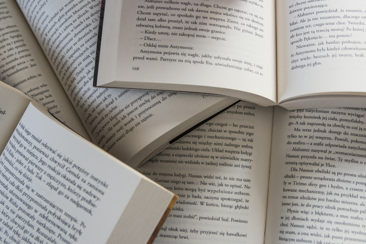
A reader opens an Amazon sample, downloads an ebook preview, or flips through a paperback. Before judging the content, they encounter something quieter: the way the book feels.
The font feels either comfortable or distracting. The chapter opener seems either intentional or improvised. The spacing gives words room to breathe, or else it crowds the page. Readers may not know the words for leading, gutter, or reflowable text, but they know when a book is easy to enter.
That is why book formatting for self-published authors is more than a cosmetic finishing touch. It is part of the reading experience and one of the first signals the book has been prepared with care.
Good formatting does not compete with your words. It helps readers trust and enjoy them.
What Is Book Formatting for Self-Published Authors—and Why Does It Matter?
Book formatting is the process of turning an edited manuscript into a readable, organized interior for print or digital publication. It includes:
- typography
- margins
- spacing
- chapter styling
- navigation
- front matter
- back matter
- file preparation
Professional formatting helps readers move through a book without being distracted by its design.
A manuscript is a working document built for drafting and editing. A publication-ready interior must guide readers through the finished book. Body text, headings, chapter titles, page breaks, images, headers, and page numbers need to work as one system. An ebook must also support linked navigation, responsive text, and different devices.
Readers do not need an elaborate interior. They expect one that feels deliberate and easy to follow.
What Do Readers Notice First in a Print Book?
Readers often experience print formatting as a feeling before they identify an individual design choice. A well-formatted page feels balanced. A poorly formatted one may feel dense, cramped, uneven, or tiring.
A Comfortable Page
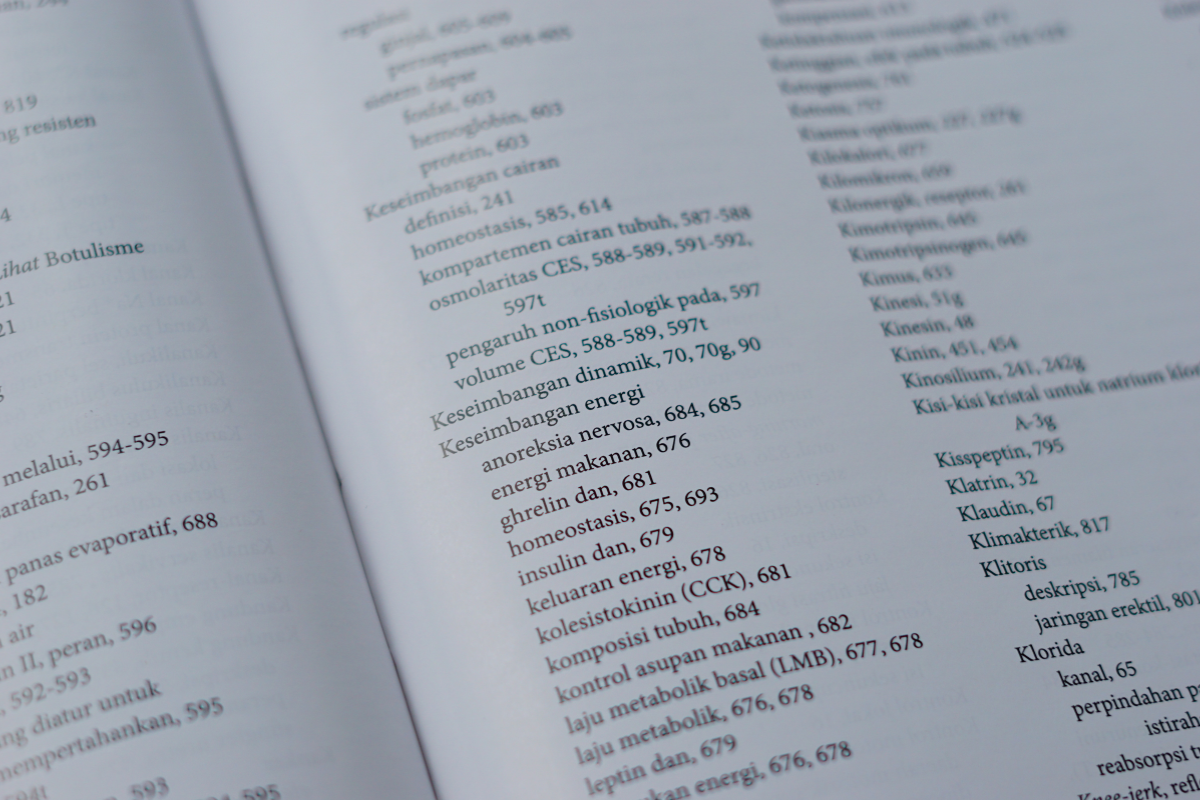
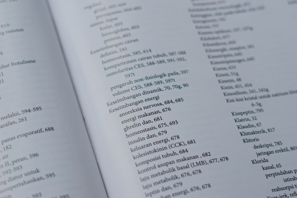
Margins, gutter space, line length, and white space determine how approachable the page feels. Text too close to the binding can be difficult to read. Lines that run too wide make the eye work harder. Pages packed tightly with text can make even engaging material seem demanding.
Trim size, binding, genre, typography, and audience all affect the right balance.
Readable Typography
A body font should rarely call attention to itself. Font size, line spacing, paragraph treatment, and alignment should help readers settle into a rhythm. Decorative type can suit chapter titles or accents, but throughout the body, it can slow readers down.
Intentional Chapters
Chapter numbers, headings, opening-page spacing, drop caps, and section breaks show readers where they are. These details can be simple, but they should remain consistent.
Small disruptions add up. Stranded headings, awkward page breaks, widows and orphans, misplaced headers, or shifting paragraph spacing repeatedly pull attention away from the content. Authors can explore these issues further in this guide to book formatting and design mistakes.
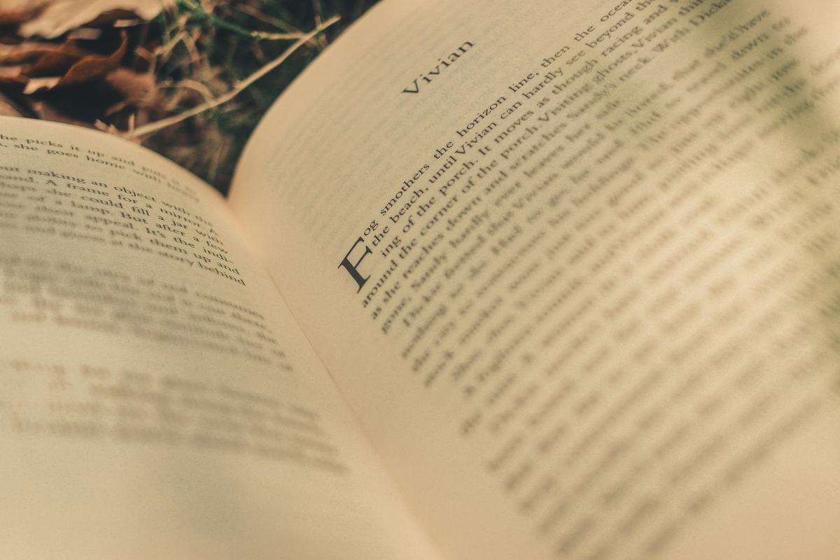
What Do Readers Notice First in an Ebook?
A print page is fixed. An ebook must adapt.
Readers may change the typeface, font size, orientation, spacing, or screen. In a reflowable ebook, text rearranges itself around those choices, so fixed page numbers, headers, footers, and rigid page composition do not translate directly.
Amazon’s current ebook formatting guidelines recommend consistent paragraph styles, heading-based chapter titles, linked navigation, deliberate page breaks, image preparation, and previewing. Amazon also explains that reflowable ebooks do not use conventional fixed page numbers, headers, or footers.
Readers experience the results when:
- Chapters begin in the correct place.
- The table of contents links properly.
- Images scale without becoming unreadable.
- Hyperlinks, notes, and special characters work.
- Paragraph indents remain consistent.
- Text stays readable when resized.
- No unexplained blank screens appear.
Ebook conversion is not simply pressing “export.” A file can look fine on one screen and break on another. It needs structural preparation and testing across device types, orientations, and font settings.
What Belongs in a Book’s Front and Back Matter?
Front and back matter orient readers and complete the reading experience.
Front matter appears before the main text. It typically includes a half-title page, title page, copyright page, dedication, epigraph, table of contents, foreword, preface, and introduction. Not every book needs every element, and the appropriate order depends on genre and content.
The title page is especially important because it formally identifies the book and introduces readers to the interior design. Authors who are unsure what belongs there can review Elite Authors’ guide to what a title page is.
Back matter follows the main text and typically includes acknowledgments, endnotes, references, discussion questions, resources, an author biography, or information about other books. It can also offer an appropriate next step, such as visiting the author’s website.
The best back matter is useful before it is promotional, offering context, resources, or a natural next step without becoming a hard sales pitch.
Does Book Formatting Change by Genre?
Yes. Professional formatting should make a book feel familiar to its intended readers—not make every title look the same.
Genre influences typography, chapter treatment, white space, image use, hierarchy, navigation, and trim size. In its publishing industry standards, the Independent Book Publishers Association includes guidance on professional interior design, readable body type, suitable leading and kerning, consistent running elements, appropriate margins, and a strategic trim size.
Fiction and memoir usually benefit from unobtrusive body text, comfortable pacing, strong chapter openings, and minimal visual interruption.
Business and practical nonfiction often need clear headings, lists, callouts, tables, exercises, and reference-friendly navigation.
Poetry depends on line integrity, stanza placement, and deliberate white space. Changes in trim size or digital reflow can affect meaning as well as appearance.
Children’s books may require close coordination between words and illustrations, age-appropriate typography, planned page turns, and fixed-layout digital formatting.
Cookbooks, workbooks, and illustrated books add tables, sidebars, image positioning, repeated design systems, and usability considerations.
The right interior quietly tells readers, “You are in the kind of book you expected to open.”
Print and Ebook Formatting Are Not Interchangeable
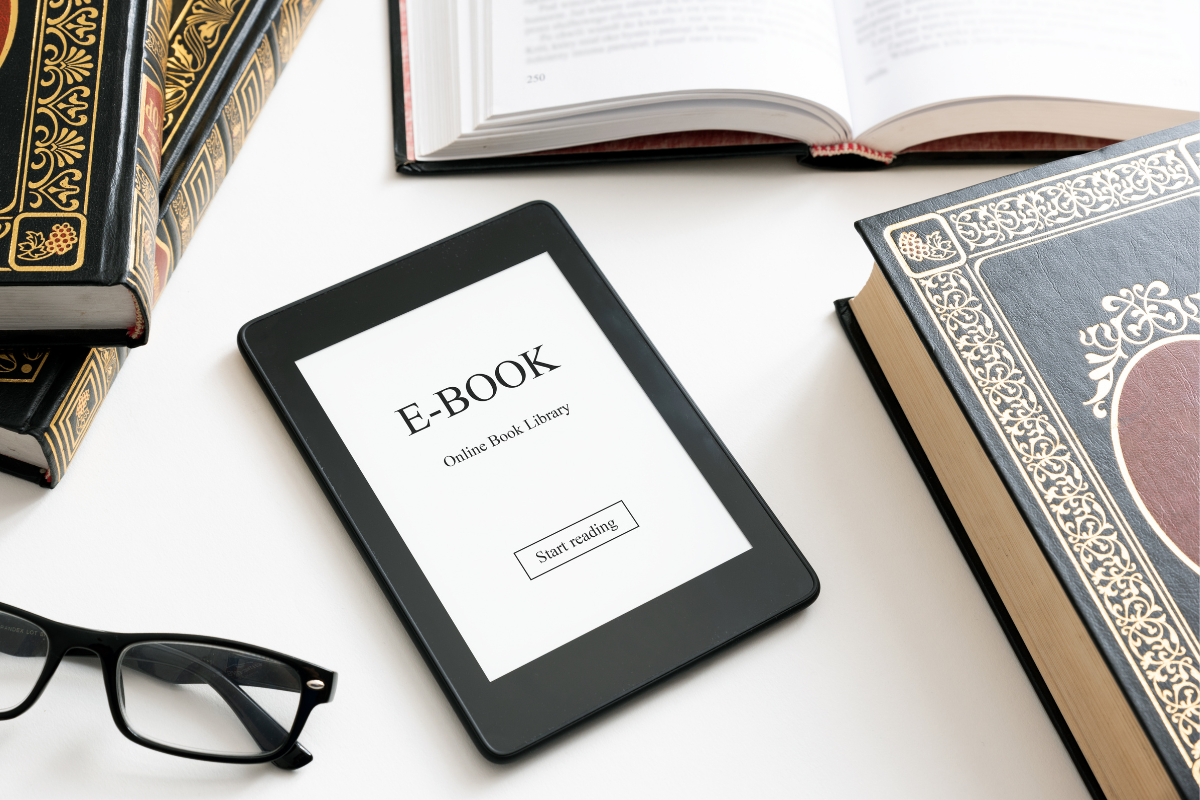
Authors publishing in both formats generally need two purpose-built outputs. Print formatting controls a physical page. Ebook formatting prepares content to adapt.
| Formatting element | Print book | Ebook |
| Page structure | Fixed pages | Usually reflowable |
| Typography | Controlled by designer | Partially controlled by reader |
| Margins and gutters | Set for trim and binding | Adjust to device or app |
| Page numbers | Standard when appropriate | Often unnecessary |
| Headers and footers | Common when appropriate | Generally not used |
| Table of contents | Page-based | Linked navigation |
| Images | Fixed positioning | Must adapt to screens |
| Typical file | Print-ready PDF | EPUB or supported digital file |
| Quality check | PDF or physical proof | Device and app preview |
A print PDF preserves the page, but that rigidity works against the flexibility expected from most text-heavy ebooks, whereas a reflowable ebook file cannot provide the fixed control needed for print.
Can Self-Published Authors Format Their Own Books?
Some authors can format a straightforward, text-only book with a reputable tool and careful review. Complexity rises with images, tables, footnotes, charts, sidebars, poetry, exercises, unusual characters, accessibility needs, or multiple editions.
Before choosing DIY formatting, ask:
- Can I create and inspect separate print and digital files?
- Do I recognize common page-layout problems?
- Can I test the ebook under different reading settings?
- Do I understand the conventions of my genre?
- Can I make corrections without disrupting the file?
This is not a test of whether you are a “real” author. Formatting is a specialized task. The question is whether DIY work provides the quality, time savings, and confidence your project requires.
When Is Professional Book Formatting Worthwhile?
Professional support is especially valuable when the interior is complex, the book will appear in multiple formats, or technical details begin competing with the writing.
A formatter creates a consistent design system, accounts for genre conventions, organizes front and back matter, prepares separate print and digital files, and provides an opportunity to review the proofs.
Elite Authors’ professional book formatting services include genre-based interior options, front- and back-matter layout, font and chapter-style choices, a print-ready PDF, and an EPUB file. The service can also accommodate specialized manuscripts, including poetry, scientific content, and picture books.
Professional help is not about making the book elaborate. It gives each detail a purpose and helps the author feel confident in the finished files.
A Reader-Ready Formatting Checklist
Before publication, confirm that
- Chapter and heading styles are consistent.
- Body text is comfortable to read.
- Margins and gutters suit the printed book.
- Headers and page numbers appear only where appropriate.
- Front and back matter are complete and organized.
- Tables of contents work in each format.
- Images are clear and positioned correctly.
- The ebook responds properly when text is resized.
- Print and digital files have been reviewed separately.
- The formatted proof has received a final proofread.
The manuscript should be stable before formatting, but the formatted files still need review. Layout and conversion can introduce new problems or reveal issues that were difficult to see earlier.
Your Book’s Interior Should Support the Work You Put Into It
Formatting does not replace strong writing or professional editing. It helps readers experience that work without visual or technical friction.
Readers don’t think about gutters, paragraph styles, or responsive text, but they will instinctively feel whether the book is comfortable and thoughtfully assembled.
That is the value of book formatting for self-published authors: It allows the content to lead.
When you are ready to turn your completed manuscript into a polished print interior and reader-friendly digital edition, Elite Authors can prepare both formats around your genre, content, and publishing goals.
Frequently Asked Questions About Book Formatting
What Does Book Formatting Include?
It includes typography, margins, paragraph and heading styles, chapter openings, headers, page numbers, images, front and back matter, navigation, and final file preparation for print or digital publication.
Do Print Books and Ebooks Need Different Formatting?
Yes. Print uses fixed pages designed around trim size and binding. Most text-heavy ebooks are reflowable, allowing the reader to change font and display settings. Each format needs separate preparation and review.
When Should a Book Be Formatted?
Format the book after major writing, revision, and editing are complete and the manuscript is stable. Then review and proofread the formatted print and digital files before publication.
Can I Format My Own Self-Published Book?
Yes, especially for a simple text-only project. Complex layouts, specialized content, or multiple formats may make professional formatting a more efficient and dependable option.
How Does Genre Affect Book Formatting?
Genre shapes visual expectations. For example, novels often use restrained interiors, and nonfiction may need stronger hierarchy. Poetry requires precise spacing, and image-heavy books may need complex or fixed layouts.
What Files Do I Need for Print and Ebook Publishing?
Print commonly requires a print-ready PDF. Ebooks commonly use EPUB or another platform-supported digital file. Always confirm the current requirements of the publisher or distributor you plan to use.